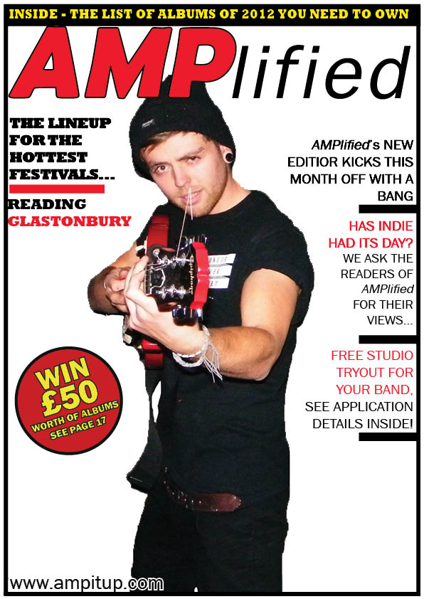
My second draft has made slight progress over the previous one. Mostly the template, font and method of using black boxes at tilted angles containing the sub description. This will be used more in my next draft.
The position of text has also changed as I liked the layout of text on one side and accompanying images on the right.
My first draft of the article consists of mostly positioning of text on the pages, there isn't enough to use to fill up most of the gaps, but its enough to make an effective article. I have created the title and accompanying description which is informal, reflecting the magazine and is quite effective.
I have completed my front cover.
I have made all coverlines the same font to make them readable whilst still keeping to the theme of the cover.
The main addition to the page is the main coverline which is coloured yellow to stand out on its own, but still keeps to the look and style of the magazine. Along with this I have altered the positioning of the main image and the coverlines to show a comfortable fit for each item on the cover. I am pleased with the outcome of it.
I have made some significant changes to the cover recently. I have added another coverline on the left hand side as well as altering to colour of different sentences to add more interest to the cover.
I have also added a black frame for the cover whilst placing a banner at the top, to attract potential buyers that can apply to a majority of people.
I added a fill for the word "AMP" in order for it to stand out for the background.
I have continued to add my coverlines to the cover whilst still trialling different fonts and sizes to use for it as well as changing the tightness of the feather tool on the main image, to be as natural as possible.
I have also added a website address to represent the brand in order to show its attempts to appeal to readers online as well as usual readers and that it has more than one platform for publication.
This is my second draft but first done in Adobe Indesign. The coverlines are not complete as there are more but so far they work in terms of positioning and style.
The colour scheme at the moment for the magazine is simply black and white, which suits the main image and contrasts the flash on the left, making it stand out.
This is the image I will be using for my front cover. I had to edit out the other band members as seen below, in order for the image to fit the front cover. Joel, pictured above, is the front man of the band therefore I have chosen to put him on the front cover to represent his featured band, Diamond City. The image works as he is making direct contact to the camera/audience and has a pose which is easily identifiable as a confident musician.