
Monday, 14 January 2013
AMPlified Front Cover - First Draft
This is my first draft of my music magazine front cover. I have the masthead in the top central position which stands out, a feature necessary for a successful magazine. The main image will act as the background whilst being very noticeable. The coverlines have their own space on the cover therefore are clear to the reader, and the main coverline stands out at the bottom of the page. It is a very minimalistic cover but effective.

Friday, 4 January 2013
Audience Research
I conducted audience research on my blog using an online poll to get suggestions for how I should produce my music magazine.
When asked which masthead people preferred, 100% of the votes chose the masthead "AMPlified", because of this, I will use this masthead on my cover.
When asked how many images should be on a front cover, 60% of voters said 1 and 40% said 3.
When asked if people would read a magazine that focused on new, aspiring and independent bands instead of established bands, 66% of voters said 'Yes with occasional mention of established bands', while the other 33% simply said 'Yes'
When asked what age group the voters are in, 75% were 15-17 and 25% were 18-20
Using this information, I can produce a music magazine cover that is mostly effective with the target audience.
When asked which masthead people preferred, 100% of the votes chose the masthead "AMPlified", because of this, I will use this masthead on my cover.
When asked how many images should be on a front cover, 60% of voters said 1 and 40% said 3.
When asked if people would read a magazine that focused on new, aspiring and independent bands instead of established bands, 66% of voters said 'Yes with occasional mention of established bands', while the other 33% simply said 'Yes'
When asked what age group the voters are in, 75% were 15-17 and 25% were 18-20
Using this information, I can produce a music magazine cover that is mostly effective with the target audience.
Tuesday, 18 December 2012
First Images
These are some of the best images I could take, with a lack of lighting and battery. I have arranged for another possible shoot in the daylight but it was a good first attempt.


Music Magazine Article Analysis
Music magazine articles, particularly double paged ones, can be displayed, laid out and visualised in many ways.
Article design can vary between not just magazines but the article contents. If you were to look at two articles in the same magazine, you would see they both vary in terms of colour, number of images, style of writing, etc. due to obviously the different people with different inputs. With that in mind, the three example below will demonstrate that point, however you will see how they all are still related by small conventions.

The first one displayed above can be described as busy, in the sense that there are a lot of items that catch your eye, the numerous pictures, headlines and quotes. The main colours being used here as you can see are red, beige, black and grey. This is the articles unique colour scheme and is used very effectively, for example "We're ready to rock" highlights the word "Rock" in red, contrasting the image behind it and therefore catching the reader's initial intention.
One convention obvious between any music magazine article is promotion. In this article for example, displays it obviously on the right in its own column, giving "teasers" into their coming album, meaning to tempt the reader to discover more about them and even buy their music. It even asks the reader to help promote them with a pug at the bottom stating "Get the word out".
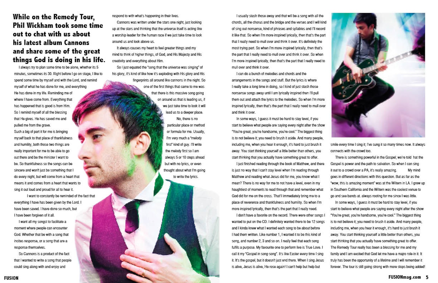
The second here immediately contrasts the first. Firstly there is more text space than image space compared to earlier. There are only two images, quite simple. It doesn't have a title, it has an opening paragraph in bold, but otherwise is quite simple and plain, with a colour scheme of white, with purple from the lighting in the images. However, again promotion is obviously in effect if you read the article, it promotes the tour that Wickham was in the middle of.

The third is similar to the second example, but more developed. For example, it still maintains a use of two images, however, they both contrast each other in terms of colour and content. Also, compared to the other two examples, the article is written in a Question and Answer format, where the interviewer lists their questions and the artists response. This generates quite an informal discussion and reader opinion of the article. The title is simply the artists name with subsidiary text boxes listing her accomplishments and quotations.
In summary, articles vary in appearance and design, however typical codes and conventions are still maintained despite the differences. For example, the text sizes are always small and boxed.
Monday, 10 December 2012
Q Magazine Mock Up - Final Draft

Sunday, 9 December 2012
Poll Survey
Instead of doing a questionnaire, I shall be using polls to get an immediate idea of how my magazine should be produced.
New polls will be added daily and I would appreciate any readers taking a few seconds to answer them on the right.
Tuesday, 4 December 2012
Reader Profile
The reader for my magazine will be in the youth age of 16-25, interested in indie, garage bands and new, aspiring bands beginning their journey in the music industry.
70% will listen to a wide variety of music whilst 30% will both listen to music and be interested in being involved in the music industry, hence reading this magazine to find out more information. 90% will be male, 10% will be female. 80% will be full time students at either secondary or higher education, 20% will have finished or left education.
70% will listen to a wide variety of music whilst 30% will both listen to music and be interested in being involved in the music industry, hence reading this magazine to find out more information. 90% will be male, 10% will be female. 80% will be full time students at either secondary or higher education, 20% will have finished or left education.
Subscribe to:
Posts (Atom)